 +1 646 595 1666
  sales@hireecom.com
 +91 8287203228

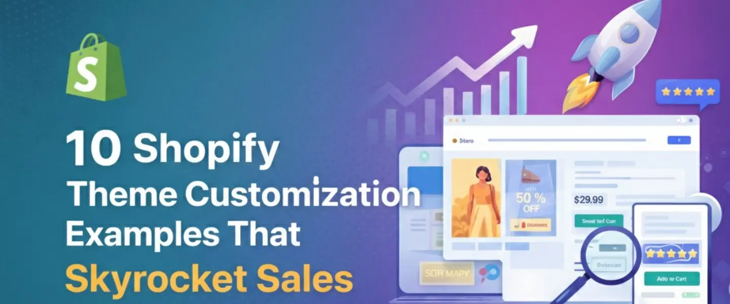
How to Build a Mobile-Friendly Shopify Store to Boost Sales
In today’s fast-paced eCommerce landscape, mobile devices account for over 58% of global website traffic. Ensuring your Shopify store is mobile-friendly isn’t just a nice-to-have; it’s a must to maximize sales and improve user experience. In this blog, we will dive into actionable strategies to create a mobile-optimized Shopify store and explore how Hire eCom can assist you in achieving this seamlessly.
Why Mobile Optimization Matters for Shopify Stores
With over 80% of online shoppers using mobile devices to browse and purchase, a mobile-friendly website directly impacts your conversion rates. A poorly optimized mobile site leads to slow load times, difficult navigation, and frustrated users—all contributing to higher bounce rates and lower sales.
Key Benefits of a Mobile-Friendly Shopify Store:
- Enhanced User Experience: Smooth navigation keeps visitors engaged longer.
- Higher Conversion Rates: Mobile-friendly sites are proven to boost sales.
- Improved SEO Ranking: Google prioritizes mobile-optimized sites in search rankings.
- Wider Audience Reach: Cater to the growing number of mobile-first shoppers.
Essential Steps to Create a Mobile-Friendly Shopify Store
1. Choose a Mobile-Optimized Shopify Theme
Selecting a responsive theme is the first step in ensuring your Shopify store adapts seamlessly to different screen sizes. Shopify offers a range of mobile-friendly themes like Debut, Brooklyn, and Dawn, which are fully customizable.
- Pro Tip: Test the theme on multiple devices before finalizing it.
2. Optimize Images and Videos
High-resolution visuals are crucial for showcasing your products but can slow down load times on mobile devices.
- Actionable Tip: Use tools like TinyPNG or ImageOptim to compress images without compromising quality.
- Video Optimization: Embed videos via platforms like YouTube to reduce bandwidth usage.
3. Simplify Navigation
Mobile users prefer intuitive and straightforward navigation.
- Use a hamburger menu to save space.
- Include a search bar for quick product discovery.
- Keep the number of categories limited to avoid overwhelming users.
4. Ensure Fast Load Times
Slow-loading websites result in higher bounce rates. Aim for load times under 3 seconds to retain visitors.
- Optimization Tools: Leverage tools like Google PageSpeed Insights to identify bottlenecks.
- Use Shopify’s CDN (Content Delivery Network) to accelerate page delivery.
5. Create Mobile-Responsive Product Pages
Your product pages should be easy to browse, zoom in on images, and add items to the cart without hassle.
- Optimize the “Buy Now” button placement.
- Ensure product descriptions are concise and readable on smaller screens.
6. Implement Mobile-Specific Checkout Options
Complicated checkout processes can lead to cart abandonment.
- Enable Shopify Payments for a seamless transaction.
- Offer multiple payment options like Apple Pay and Google Pay.
7. Test and Iterate
Regular testing ensures your mobile store remains up-to-date with the latest design trends and functionality improvements.
- Tools to Use: Test your store on BrowserStack or Google’s Mobile-Friendly Test.
How Hire eCom Supports Your Mobile Optimization Journey
At Hire eCom, we specialize in helping eCommerce brands like yours thrive in the digital space. Here’s how we make mobile optimization a breeze:
1. Expert Team of Developers
Our certified Shopify developers create custom, mobile-friendly themes tailored to your brand. With over a decade of experience and partnerships with 85+ brands, we understand what it takes to drive results.
2. Comprehensive Optimization Services
From image compression to navigation enhancements, we implement end-to-end solutions for mobile optimization. Our ISO 9001:2015 and GDPR compliance ensure your store’s security and quality standards.
3. Data-Driven Strategies
Using advanced analytics tools, we identify areas for improvement and tailor your Shopify store to align with user behavior.
4. Ongoing Support
We provide continuous monitoring and updates to keep your store mobile-friendly as trends evolve.
Real-Life Success Stories
One of our clients, a leading apparel brand in the US and UK, experienced a 35% increase in mobile sales within three months of optimizing their Shopify store. By implementing faster load times and streamlined navigation, we turned their mobile site into a revenue-generating powerhouse.
Key Takeaways for Building a Mobile-Friendly Shopify Store
- Choose a responsive theme and test it thoroughly.
- Optimize images, videos, and navigation for faster load times.
- Simplify your checkout process and enable mobile payments.
- Regularly test your store’s performance and make necessary adjustments.
Let Hire eCom Transform Your Shopify Store
Building a mobile-friendly Shopify store doesn’t have to be a daunting task. With Hire eCom’s expertise in Talent, Tech, and Tactics, we ensure your eCommerce business is set up for success in the mobile-first world.
Ready to optimize your Shopify store? Contact Hire eCom today and let’s turn your mobile visitors into loyal customers.
Frequently Asked Questions (FAQs)
1. Why is mobile optimization crucial for Shopify stores? Mobile optimization enhances user experience, increases sales, and improves your store’s SEO ranking.
2. How can Hire eCom help with Shopify optimization? Hire eCom provides end-to-end services, including theme customization, speed optimization, and ongoing support to ensure a seamless mobile shopping experience.
3. What tools can I use to test my store’s mobile performance? You can use tools like Google’s Mobile-Friendly Test, PageSpeed Insights, and BrowserStack for comprehensive testing.
4. How often should I update my mobile store? Regular updates are essential to stay aligned with changing user behavior and design trends. Aim for quarterly reviews.
Optimize your Shopify store for mobile success with Hire eCom’s proven expertise in creating powerful eCommerce solutions. Get started now!